|
|
Post by spenoza on May 14, 2021 17:29:49 GMT
There are some game box/case/manual cover art works that really stand out to me as awesome. I want to know covers you folks love? Do you love them because they are awesome, or even because they are so bad they are good? I'll share my recent favorite below. Also, does anyone know a great source of high-quality scans of this art for the PCE/Turbo?
|
|
Deleted
Deleted Member
Posts: 0
|
Post by Deleted on May 14, 2021 18:47:27 GMT
Nothing stands out to me, but I guess I've never been appreciative of box art in the past (for any game system). I have noticed, compared to Japanese releases, the TG16 received the short end of the stick when it comes to hucard art.
Maybe that is one, albeit small reason the TG16 failed in NA. A lot of NA hucards seem to resort to having just the name printed across when it should have been an opportunity to put some amazing art on there.
|
|
|
|
Post by dshadoff on May 14, 2021 19:48:40 GMT
Maybe that is one, albeit small reason the TG16 failed in NA. A lot of NA hucards seem to resort to having just the name printed across when it should have been an opportunity to put some amazing art on there. I have to agree. Why bother with color at all, if it's going to be so simplistic ? I remember very clearly from that time, how all of the Japanese releases had much better art, and many had full-color printing in the instruction booklets. All of the Asian magazines (Japanese, and the Taiwan/Hong Kong knockoffs) were substantially full-colour with lots of screenshots... but the American printing in all cases was essentially monochrome, possibly with a few token pages of colour (which generally wasn't used to its potential either). It was really depressing. And of course, if you compared prices, the North American prices "at the local cash register" were nearly double the prices in Japan... so much of a difference that a Japanese game, coming here (Canada) via Hong Kong, in small quantities, could still be sold at similar prices to the American releases. So, to answer the original thread... pretty much any of the Japanese art was quite good, and the American stuff was... laughable. Probably my favourite was Super Darius. |
|
|
|
Post by gredler on May 15, 2021 9:52:06 GMT
I have rose colored goggles for turbo cover art and games in general. I didn't have a ton of games and was pretty young ( ~11 ) when I got the system and a handful of games, but my favorite from that bunch was parasol stars. It was basically untouched from the pce version which was unknown to me and also probably why why I thought it was so much better than the rest of my games cover art at the time. Looking back at it now I can see how a 11 year old would be appealed by the vibrant array of colors used, and vivid images of what the game contained  |
|
Deleted
Deleted Member
Posts: 0
|
Post by Deleted on May 15, 2021 16:06:07 GMT
I've always liked the Legendary Axe box art.   There's just something about those odd appendages that draws me in. Does the black border around the box hurt it? Yes, I think it does. It probably would have been more imposing, and drawn the gamer in better, if it had encompassed the entire box, even removed the name and genre at the top. Not that the name and genre at the top is too colourful for my tastes, but I think the overall appeal/brand of the TG16 would have worked better without then with in this case. |
|
majors
Punkic Cyborg
 Have cabs, will travel
Posts: 158
Fave PCE Shooter: Parodius
Fave PCE Platformer: Legendary Axe
Fave PCE Game Overall: Spriggian
Fave PCE RPG: Ys
|
Post by majors on May 16, 2021 2:13:20 GMT
It's commonly agreed that TG-16 box art is a hot mess. Another reason to opt to collect PCE over TG-16  But a few are at least non-ofensive such as: 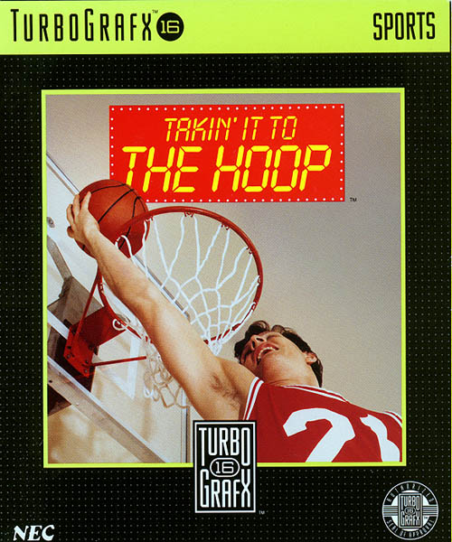 Takin' it to the Hoop 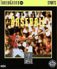 World Class Baseball |
|
|
|
Post by dshadoff on May 16, 2021 4:10:51 GMT
Ys I&II was also good
|
|
|
|
Post by spenoza on May 16, 2021 13:09:00 GMT
Falcom’s covers were always fantastic. They had a great stable of artists.
|
|
|
|
Post by dshadoff on May 16, 2021 13:11:56 GMT
Actually, Ys I&II is a rare case where the American cover art is as good as the Japanese cover art (maybe even slightly better).
|
|
|
|
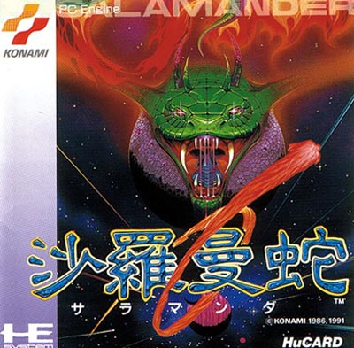
Post by tron on May 18, 2021 6:34:40 GMT
That's a easy one salamander and gradius II.
|
|


 But a few are at least non-ofensive such as: